Crystal Bridges Museum of American Art Rebrand
The original branding for Crystal Bridges was created in 2010 by an external firm, before the internal design department had been hired. As our 10th anniversary neared we were also bringing online a new brand for the Momentary, our satellite contemporary art location. This allowed us to work with our founder, Alice Walton, to update our existing brand to be more inclusive, legible, and pair better with the Momentary.

This was our original logo. It utilized 5 colors, and thus had to be created in three different forms. This was the major reason for updating. The font, also, was never utilized outside of this use, so the logo didn't feel coherent with our collateral. All versions of this logo were lacking in digital formats, as it did not reproduce well at a small scale.

We never deployed the multi-grayscale version. In 2016 I implemented a slight revision and strengthened the weight of the black and white logo. Also shown here is the logo created for the Momentary, which opened in early 2020. This was the leverage needed to make change—we started working on a singular logo.

Above shows the before and after. Our goals were to strengthen the brand, create a more legible and accessible logo—and make it versatile, with a focus on web, mobile, and digital advertising. I did not want to remove the heart of the brand, the arch icon, because those were important to our founder and directly reference our iconic architecture. So we increased the visual strength of that icon even more, and adapted a sentence case font which aligned with our welcoming mission (+ is more legible for audiences with ADA needs).
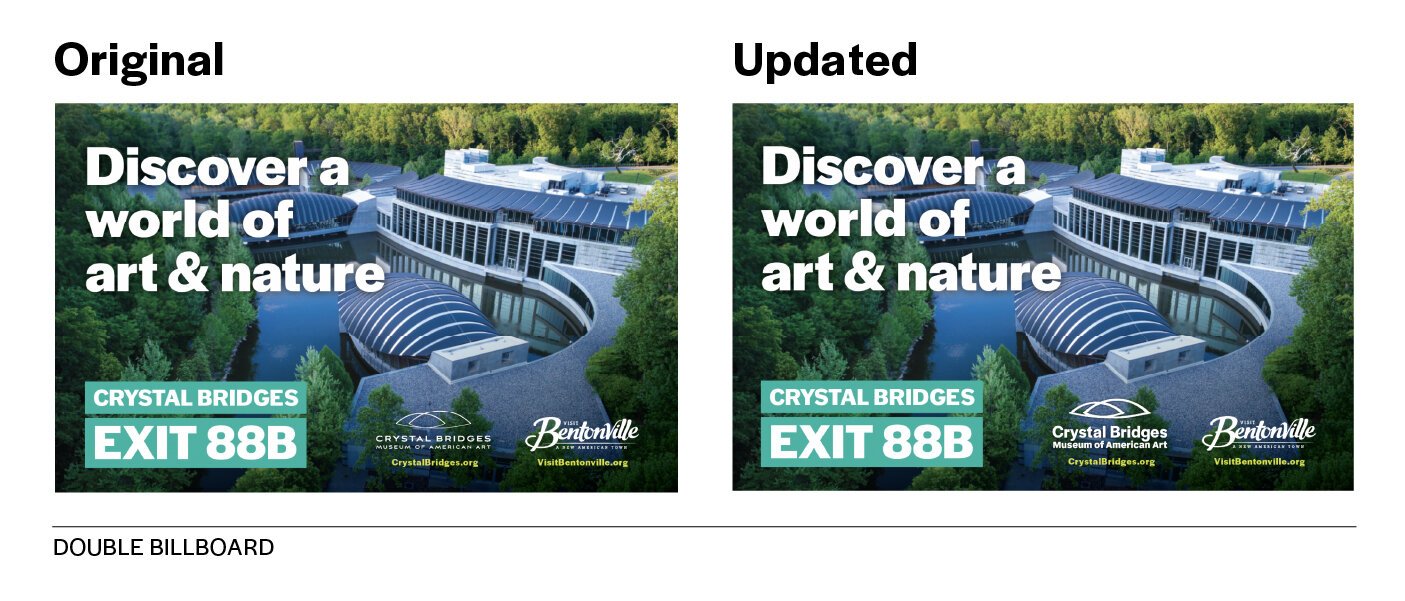
Below are a few examples of the impact the new logo has, in visual presence and legibility.


Our next step was color. The decision for this was two-fold. A: simply put, we needed a more legible color. Pushing hard to always be within ADA guidelines was a constant struggle. You can see above that we had to darken the teal by two shades, but it still wasn’t enough. Being as inclusive as possible was important to our brand. And B: with the Momentary brand coming online with its own brand color of red, we needed a color that would complement instead of clash.

There are many reasons we landed on cobalt as a main brand color. After market research we wanted to stand out from the crowd. Cobalt also allows us to retain a portion of our founding logo, to keep nature a part of our brand culture. It’s also an obvious choice for ADA, as it’s one of the most legible colors online, so we are even more inclusive as a brand.
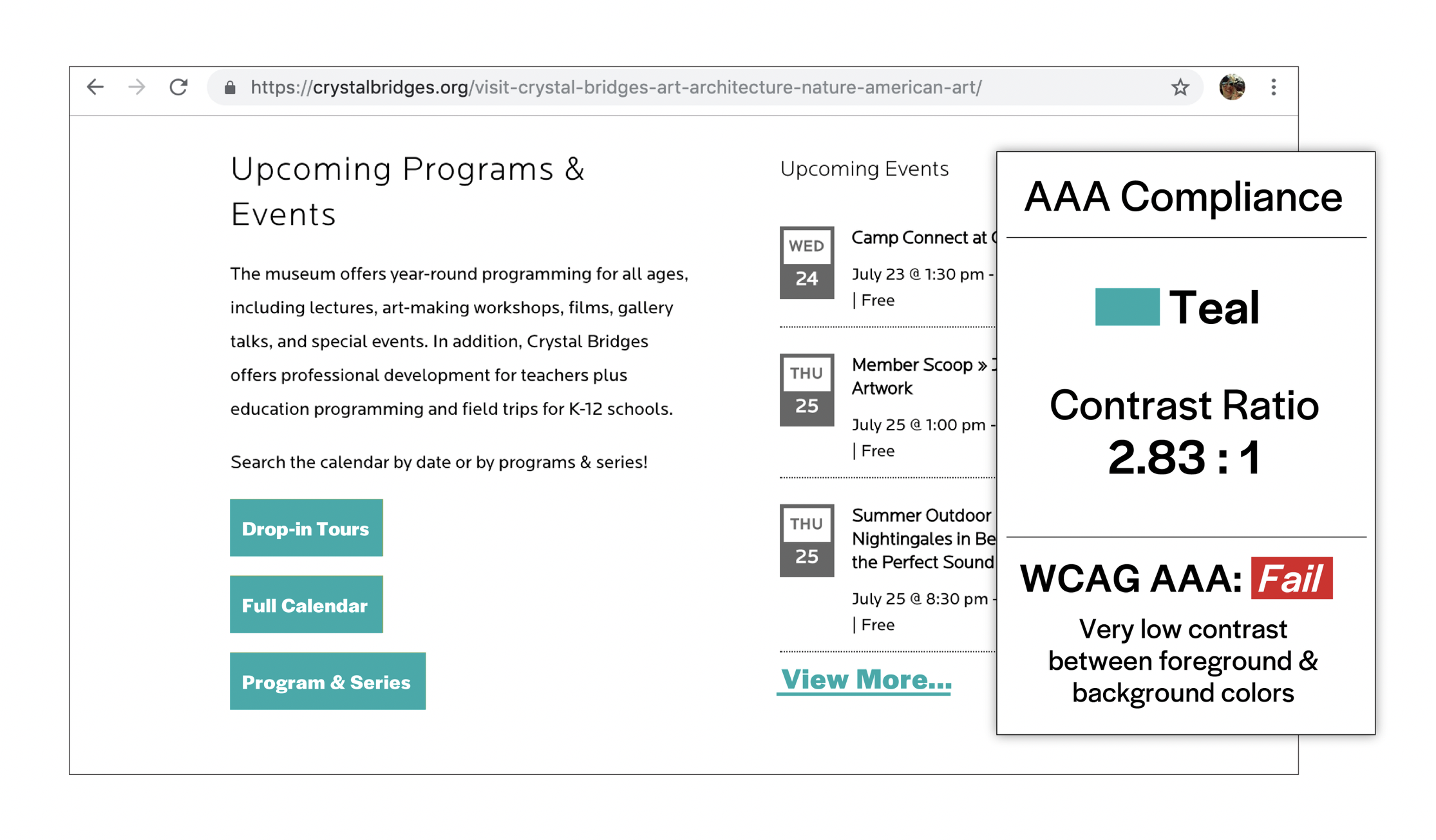
Below you can see the before and after of our WCAG AAA testing, which carries over nicely into print formats.


Now we have two brands that could stand on their own but also work well together.
Check out CrystalBridges.org to see more of the rebrand.